
Hi Caitlin!
I spent quite a bit of time with these pieces and am excited to show some designs to you.
Please take a look at the options on this page and leave any feedback that you would like at the bottom of the page. This will help me prepare for our next meeting which can be via Zoom or in person- whichever you prefer.
I pulled from four collections:

Ornate

Black and rustic

Bamboo

Gloss lacquer
1. Feather
This one I had shown you previously and you liked this combination. It is a highly textured black frame, fabric mat with black core, and museum glass/acrylic.
Museum Glass is advisable for this piece. (They also make a museum-quality acrylic that would be “safer” because it doesn’t shatter; it is more than twice the cost, though, at $564 per sheet, ouch!
If ok with you, I’d like to talk to a conservator about steaming or lightly ironing some parts from behind to get some of the wrinkles out. The paper is super thin and shows every little wrinkle. I understand it’s very valuable, and plan to take no risks.
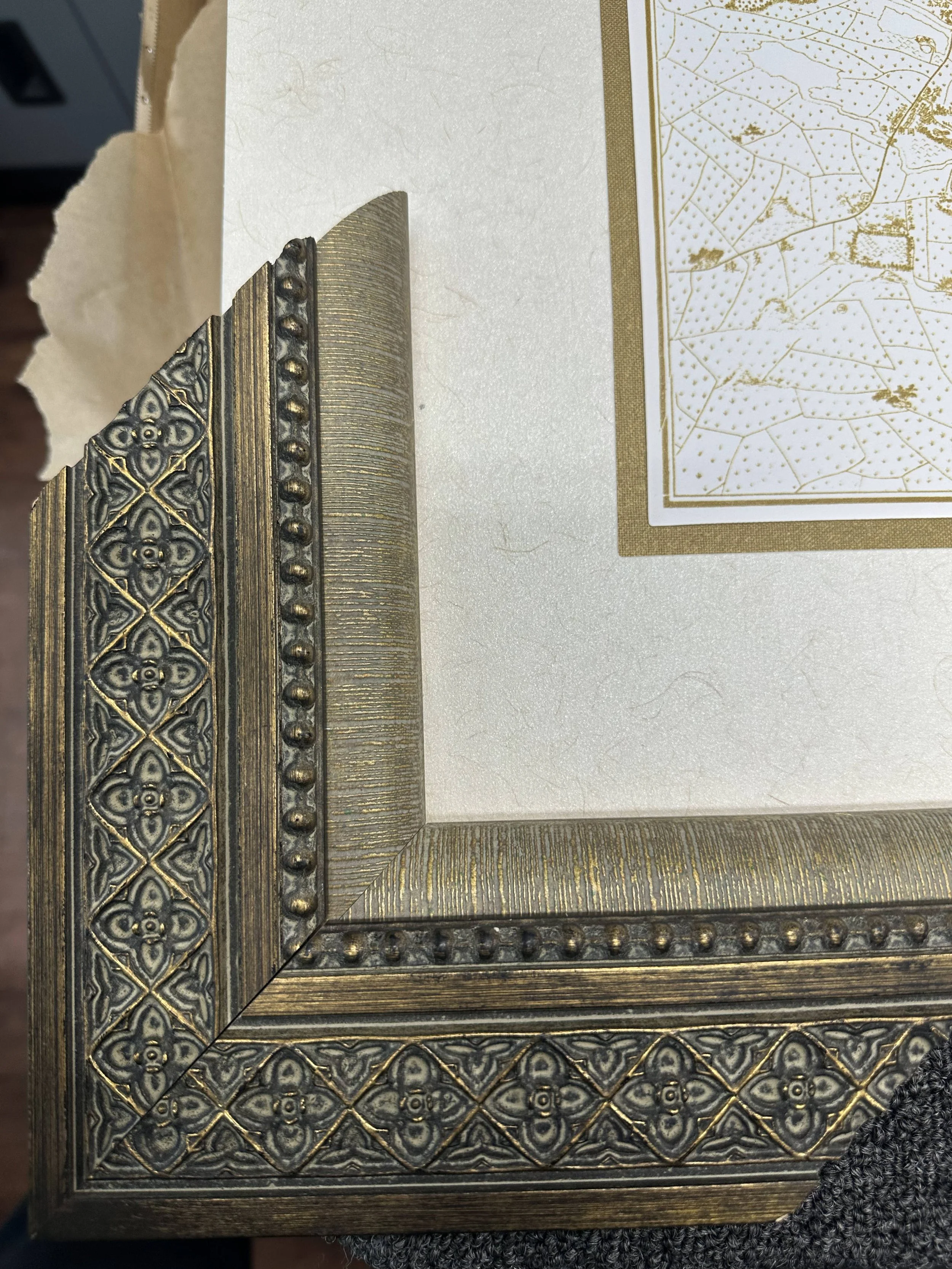
2. hanoi old quarter


This frame was made for this piece. It has so much depth and interest, and proportionally perfect.
The edges of this art are so cool I’d recommend we celebrate them by floating it over a textured mat (as pictured).
I see two good mat options here. A lighter gray that matches the piece OR a darker suede that provides more contrast. What do you think?
3. HANOI Green


This produced my favorite designs- especially these stacked frame combinations.
The first two are show-stoppers. I also threw a very minimal design in here as well. Do you have a favorite?
4. Big red


Hard to tell from the photos, but the silver bamboo (e) and gold ornate (f) both have red mixed in with the flakes. Not only does this connect with the piece, but could help tie- in with other gold and/or silver pieces.
Do you have a favorite?
5. Del La Ville De Saigon


With this smaller piece, the bamboo really steals the show. Here it is, along with some variations.
Do you have a favorite?
6. ALPHABET


The black bevel provides a nice high-contrast edge. Some of these have a red bevel.
Do you have a favorite?
7. H


Hard to tell from the photos, but the yellow inner-frame matches really well with the “H”. Option “d” shows this better than option “f”; they are the same.
Do you have a favorite?
This will be a spectacular display!
Please leave any thoughts you have below, and we’ll go from there. The next step is fine-tuning designs and talking about pricing.